

Naoshima New Museum of Art Pre-Talk Vol.2
Announcement of the Naoshima New Museum of Art Logo
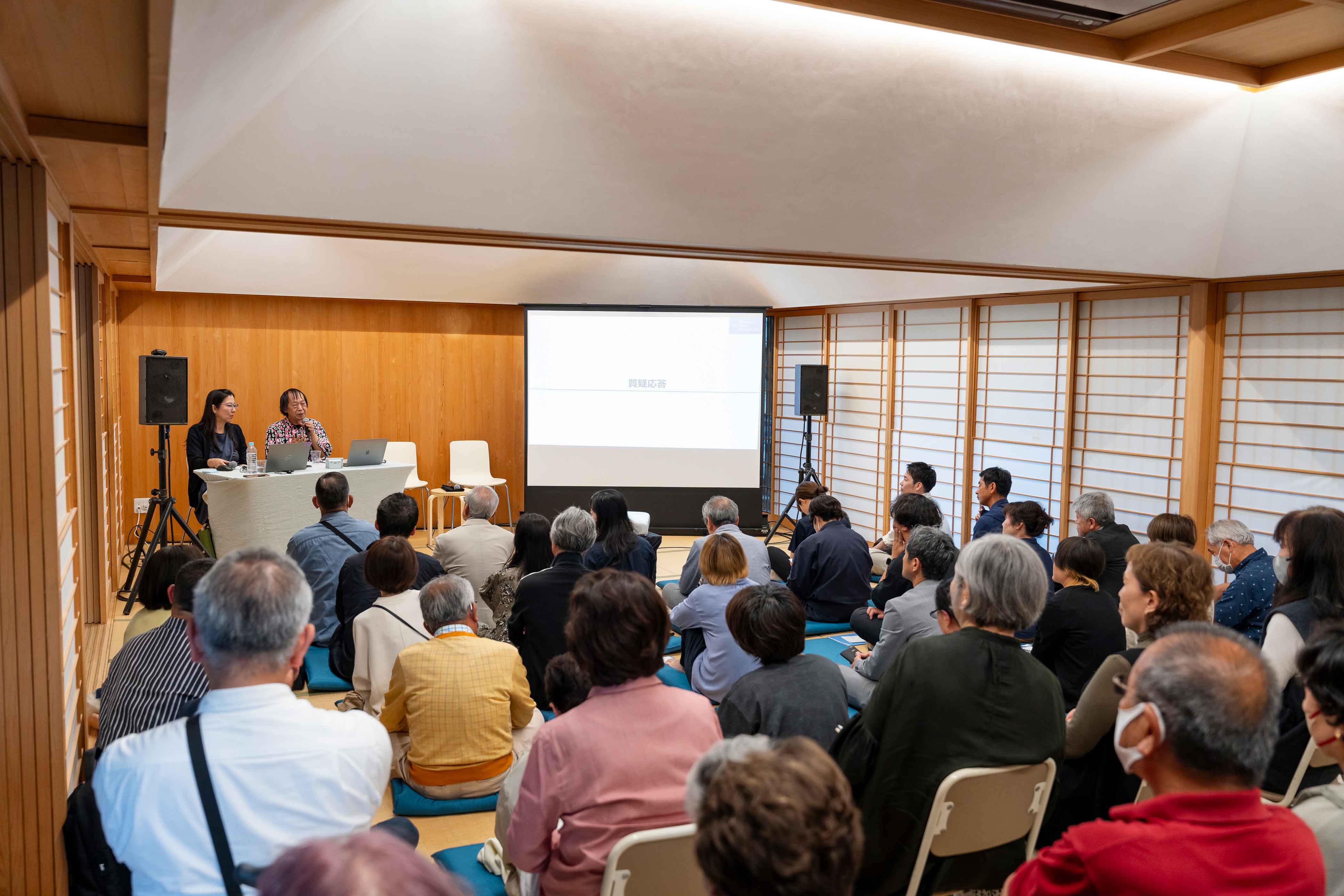
On May 31, 2024, at the Naoshima Hall community center, as part of the second in a series of pre-events for the opening of Naoshima New Museum of Art, we invited Sobue Shin, the designer of the museum's logo, to speak about the logo.
Naoshima New Museum of Art Pre-Talk Vol.2
Announcement of the Naoshima New Museum of Art Logo
On May 31, 2024, at the Naoshima Hall community center, as part of the second in a series of pre-events for the opening of Naoshima New Museum of Art, we invited Sobue Shin, the designer of the museum's logo, to speak about the logo.
Sobue Shin:
Many of you may be wondering why I created a logo for an art museum, because I usually introduce myself as a book designer. So, I would like to start by sharing my thoughts on book design before I reveal the logo of the Naoshima New Museum of Art.
Perhaps for some, it is difficult to understand what exactly it means to design a book. When I showed my mother the Japanese edition of a picture book from Dick Bruna's "Miffy" ("Usako-chan" in the Japanese edition) series in which I was involved, telling her, "I designed this book," she said, "You did such a good job drawing it." I responded, "No, it's not me who drew these pictures, it's Mr. Dick Bruna," to which she then said, "Then you colored it well, didn't you?" "No. that's also Mr. Bruna," I told her. Our conversation continued, "You printed it out well." "No, a printing company did it, not me." Finally, it ended up with my mother asking me something like, "What did you do, then?" This example is an extreme case, but similar situations are not uncommon.
Dick Bruna was originally a graphic designer and became a picture book author at some point afterwards. When a revised Japanese edition of his books was going to be republished, I was appointed as the designer. To me, book design is less about deciding the layout and more about maintaining an appropriate distance between the visual aspects, or the text of a book, and its reader. In other words, to be engaged in "relational aesthetics." For the "Miffy" series, the font used in the previous edition seemed old-fashioned. Since Bruna placed importance on the sounds of words, I wanted to create a font to encourage children and other readers to read the book aloud slowly. In other words, I hoped to offer a comfortable distance between the world of "Miffy" and the people who encountered it.
Now I would like to talk about the logo of the Naoshima New Museum of Art. I understood in my own way that the new museum was created with an aim to embrace diversity and change, as well as exist as a place for people to foster exchanges. I used "flat and low" Mincho font as the base of the logo for the new museum. While the Mincho font has variations in which the difference between the thickness of vertical strokes and horizontal strokes is smaller, I decided to adopt this particular style of Mincho. This Mincho style first appeared in Japan around 1941. Since a font that was easy to read when reduced in size was desirable during a time when printed matter, such as newspapers, had to be filled with as many characters as possible, even in small spaces, font styles with bigger counters became standard in the printing industry. To Apple computer users, such styles may seem familiar. Early PCs were loaded with such types of fonts. Since text on computer screens had to be easy to read whether reduced or enlarged, newspaper-type fonts were the first choice. When told, "This is the logo of the Naoshima New Museum of Art," some may doubt whether it is truly a logo or simply a name written in an existing font. In my opinion, if a logo is something too catchy, like an emblem, it has a tendency to seem obsolete when the times change. My ideas as such have not changed since I created the Chichu Art Museum logo. For the Chichu Art Museum, I also created a Mincho-based logo. With the idea of creating a logo that could evoke something timeless, unaffected by changing eras, I chose to develop it using relatively neutral letterforms as a base. For the Chichu Art Museum, Teshima Art Museum, and the Naoshima New Museum of Art, I created foundational typeforms based on Mincho-style lettering, while preserving a strong sense of each museum's individual identity.
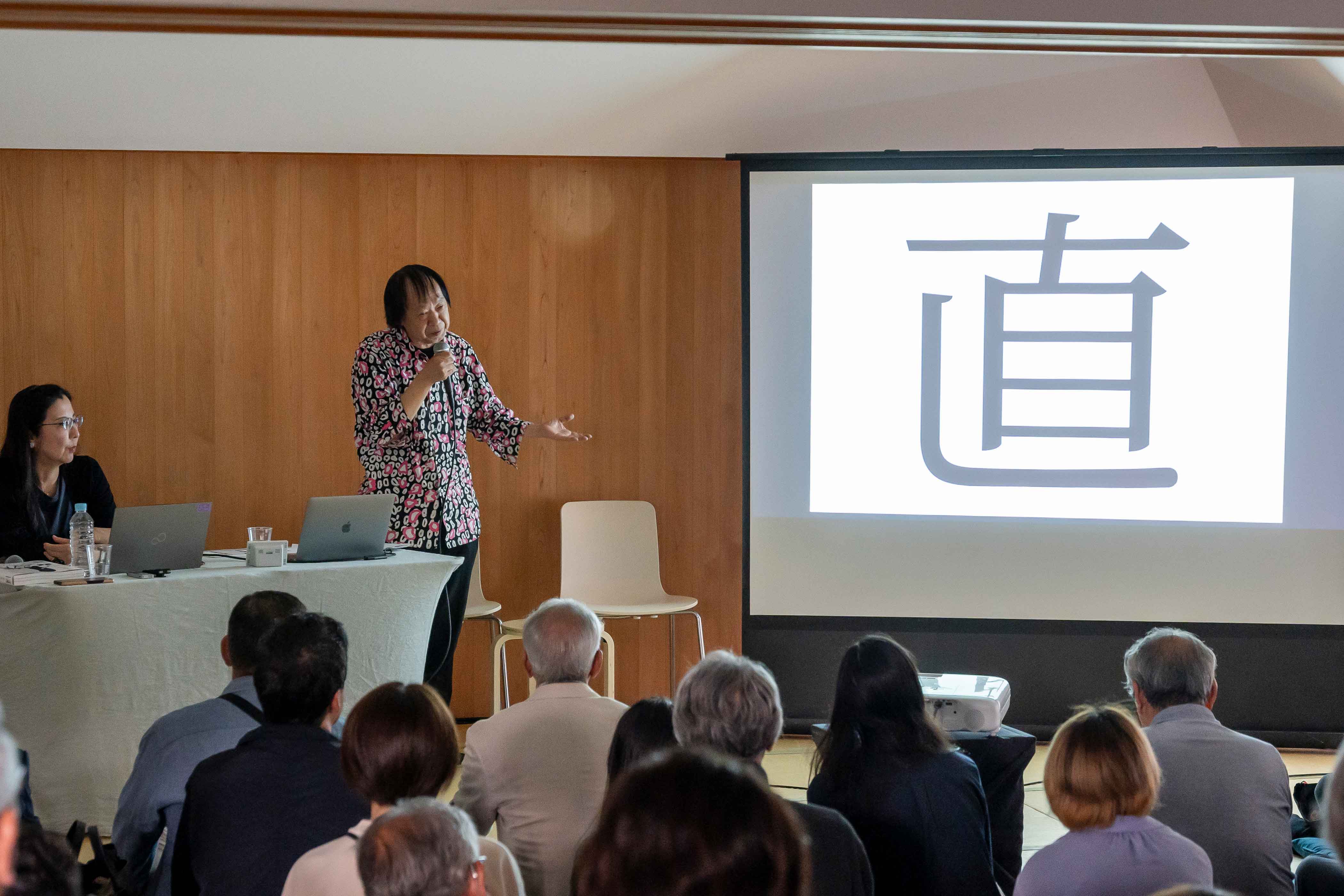
The letter "直" features the final stroke like an "L" having a round curve. This kind of直 has actually existed since long time. Issues of typeface, font, style, etc. may sound complicated, but historically, kanji(Chinese characters) of a particular font have been changed slightly when the size was changed. Referring to such a traditional aspect of lettering, so to speak, I decided to use直 with the gently curved last stroke as the base for the logo design. I created a similar 直 for the logo of the Naoshima Fukutake Art Museum Foundation (currently the Fukutake Foundation) as well. In its English logo, I used the font "typewriter" as its base. I designed a typeface that has a journalistic feel, capable of clearly conveying the present.
I would now like to speak about the logos I created prior to the Naoshima New Museum of Art, which are those for the Chichu Art Museum, the Teshima Art Museum, and the Fukutake Foundation. I designed the Chichu Art Museum logo, placing importance on the solid, geometric strength of the image of the architecture by Tadao Ando, which seems as if it is heading straight towards the heavens and the earth. Based on "shogo-katsuji", a representative font of early Japanese metal types, the logo has a modern expression. For the museum's English logo, I adopted a Roman typeface derived from Garamond types, which are familiar to Japanese people and feature classic elegance while complementing Japanese text. In contrast to the Chichu Art Museum logo, I created the Teshima Art Museum logo based on a different Mincho type that is reminiscent of hiragana (Japanese syllabary), which maintains traces of brushstrokes. Unlike the hard image of the Chichu Art Museum logo, Teshima Art Museum's logo was based on a Mincho type that is so soft, rich, and natural that it is hard to tell whether it is Mincho type or Kaishotai type, and so it evokes wings stretched out wide. For the English logo, I used Trajan, the world's first Roman font. The logo of the Fukutake Foundation is Gothic instead of Mincho. Its shape does not change whether enlarged or reduced in size. Its thickness does not change, either. Even when the logo is extremely enlarged, it remains somewhat modest and also consistent.
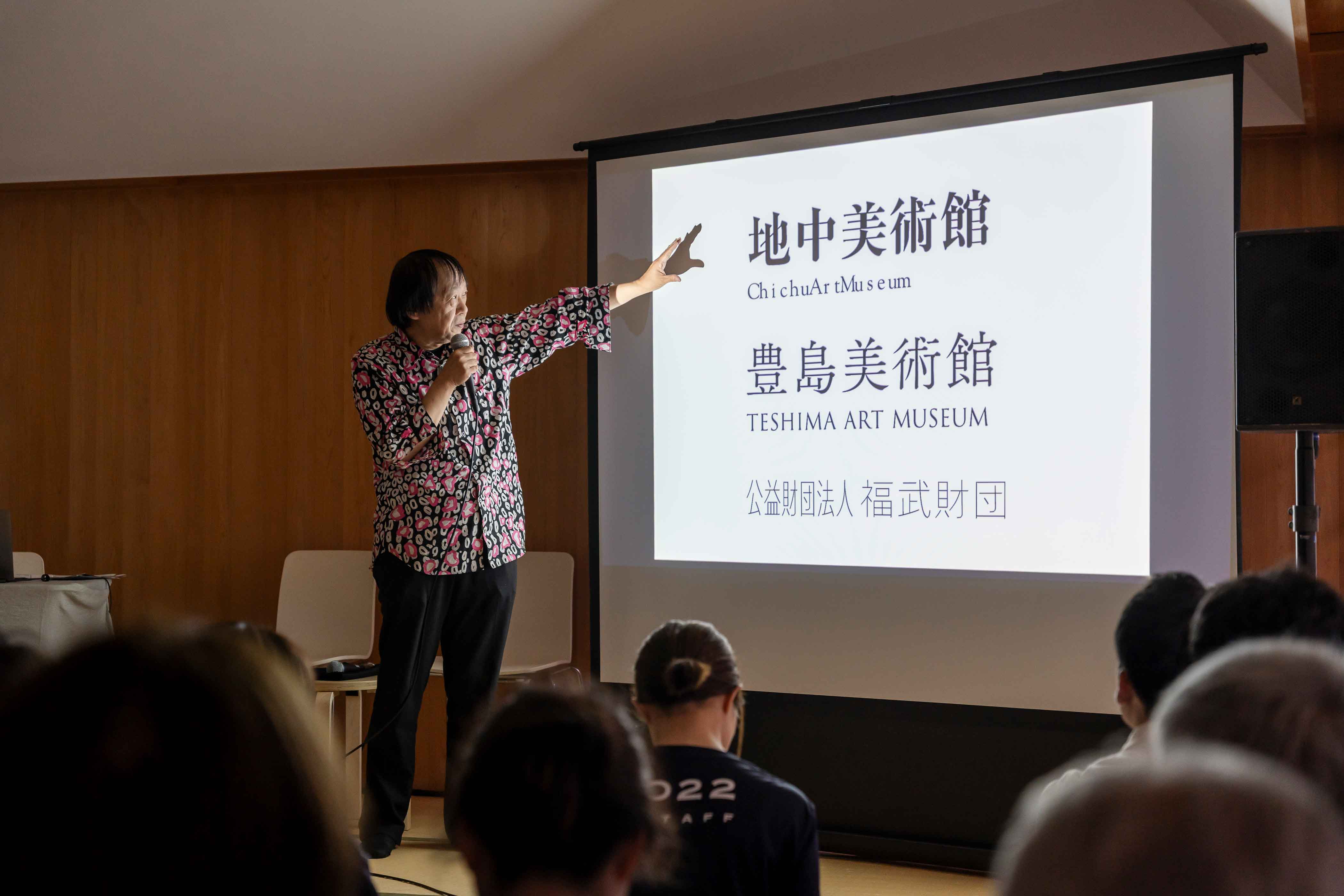
The images evoked by the Chichu Art Museum logo are gravity, artifacts, unit, and geometry. For the Teshima Art Museum, they are immutability, water, and time. The place does not change, but it changes with time ― so mysterious like a life. As for the logo of the Naoshima New Museum of Art, I designed it to evoke images of change, communication, interaction, and neutrality since I heard that the museum would have actively changing exhibition programs. In regards to colors of the logos, I decided the color of the Chichu Art Museum logo by number play. Perhaps you may have learned in school that you can make the color black by mixing all the colors. However, when you mix equal amounts of three ink colors of cyan, magenta, and yellow, it doesn't become gray. Surprisingly, it becomes dark brown. Though not allowed in printing rules, I made the color of the Chichu logo by combining magenta 50%, yellow 50%, and cyan 50%. That is to say, my idea was to embrace a broken balance caused by number play. I cannot express it precisely, but it has a special beauty. The color of the Teshima Art Museum was more or less pure white. However, it was not an artificial, titanium kind of white, but rather a warm off-white. I am still considering the colors for the Naoshima New Museum of Art. Perhaps either ink black on white, or a black brighter than jet black on white. It could be monochrome, basically black-and-white, rather than with colors.
A logo is about projecting an image. Branding activities follow. The difference between a logo and branding may be hard to tell. A logo is a communication tool, and the most important thing for a logo is to convey an image. I think branding is how a logo should be used afterwards, together with the change of the times. Therefore, the task of branding is not completed when a logo is completed. Many years ago, there was a trend related to CI (Corporate Identity). Companies wanted to create logos to clarify their images. However, when a logo is created for such a purpose, the logo will likely seem out of fashion when the times change. In a sense, this is because the logo is one-sided. I strived to avoid this in creating the logo of the Naoshioma New Museum of Art. How logos are used changes with time. That is why logos should be simple and flexible while featuring the characteristics of each organization or entity. For the Naoshima New Museum of Art, I hope you look forward to the development of the logo. It is also my hope that the logo is looked after together by all of us.
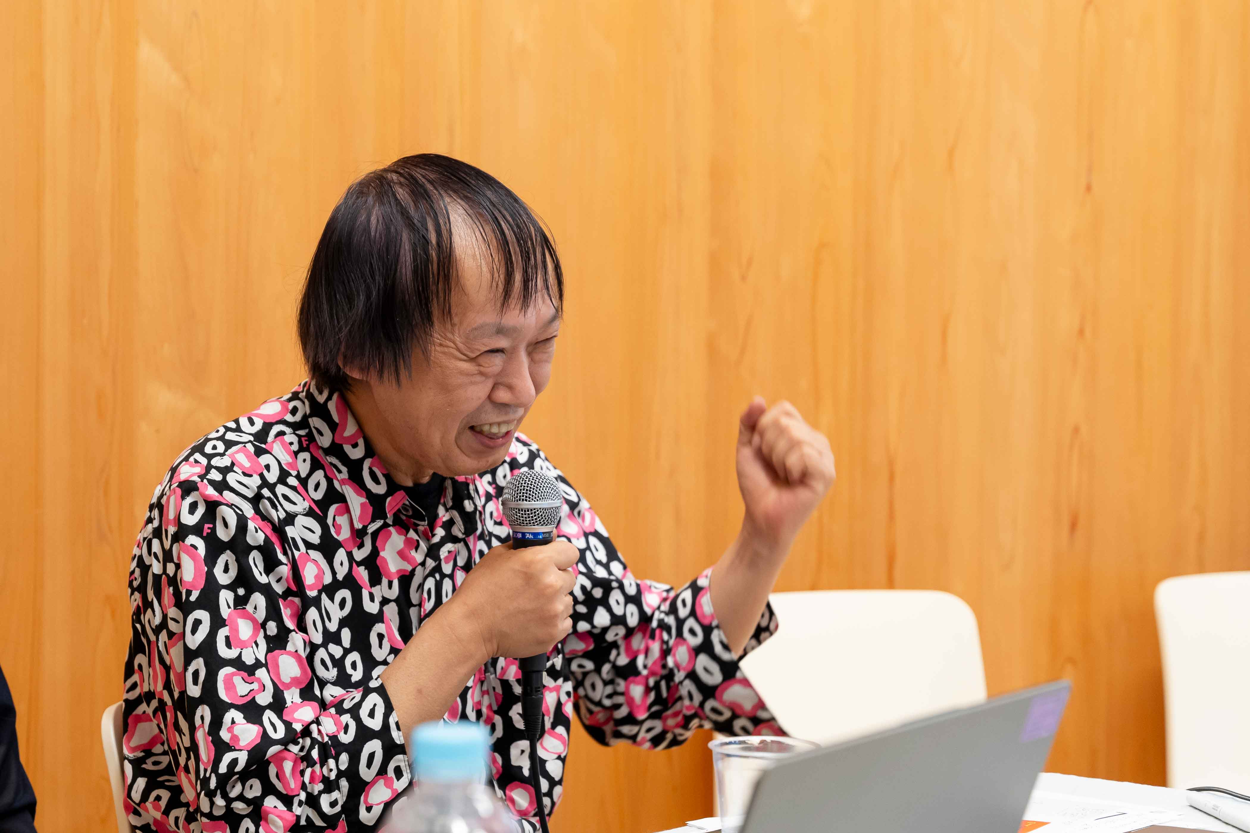
I think a designer's mission is to take good care of the distance between the viewer and the object being viewed, whether it be a logo design or a book design. Recently, I like to say, "A designer is a distance maker." I ask questions about how I can mediate the comfortable relationship between people and things and ensure that it is not too close, not too far, and not too one-sided towards either of the two parties. What is the right distance? I always want to think about that. I also think about the "ability to be enchanted" and the "joy of something not working." The "ability to be enchanted" is how one can get carried away when seeing something incredibly lovely. For example, it is forgetting about what one should be or how the rules should be when one is purely fascinated. I think it is sometimes important to be enchanted by something that is typically regarded as unfavorable. As for the "joy of something not working," generally speaking, logic and efficiency are standards that are important and easy to follow. However, if such things are the only criteria, we may stop thinking on a deeper level and be left with fewer chances to become enchanted. A book, a museum, a person, or a glass......Whatever it is, when you discover something like a small incongruity or a rift, you may feel that somehow it is a blessing without first judging whether it is good or bad. That is the joy of something not working. It seems to me that more and more people fear what doesn't work well and what may not go well because they believe that this is a nuisance. I think this is quite a pity. As I mentioned in the beginning, in my everyday work as a designer, I think about "relational aesthetics" and try my best to make the most of our "ability to be enchanted" as well as nurture the "joy of something not working."
Speaker Profile
Sobue Shin
Art Director
Sobue Shin
Art Director
1959 - 2026. Born in Aichi Prefecture. Sobue Shin is an art director and the director of Cozfish. A master at creating extraordinary and enchanting works, he works across design disciplines, including book and exhibition design as well as merchandise branding. He designed the logos for Chichu Art Museum and Teshima Art Museum, provided art direction for Snoopy Museum Tokyo, and has handled graphic and merchandise design for many exhibitions, including ones about Miffy, Evangelion, Momoko Sakura, and Hokusai. Sobue is a member of TDC and AGI.